10 November 2026 · 5 min read
One sidebar for every tool, and a blog with pictures
The day every OScar tool got the same sidebar: groups, folders with their contents, coloured arrows and a hub icon. Plus Draw comments you can switch off and edit, calmer forms, a tidier Photos and a blog that draws its own pictures.
Welcome to the first entry of the OScar changelog, the place where I write down what changed in OScar, the personal desk I build and use every day. Some days are a gentle spring clean. This one started that way and then grew into a proper renovation: every tool got the same sidebar, the blog learned to draw its own pictures, and a long list of small things became a little kinder. Grab a coffee, here's the tour.
One sidebar to rule them all
A few days ago Draw got a sidebar I really liked: groups at the top level, folders inside them, your drawings listed under each folder, and everything draggable. Today that sidebar became the standard for every tool. Notes, Documents and Photos now look and behave exactly like Draw, and every other tool follows the same rules up top.
- Groups hold folders. A group is a bold heading you can open and close, drag into a new order, and right-click to add a folder to. To keep everything safe during the move, every folder you already had now lives in a group called Starter, ready to be sorted into new groups whenever you feel like it.
- Folders show what they hold. Click a folder and it opens in the sidebar and on the page at the same time. Its notes, documents or photos are listed right under it (photos even get a tiny thumbnail, so you can tell the sunset from the receipt), followed by a "+ Add" button and its subfolders.
- The open folder gets a grey "room". Its grey background runs down over everything inside it, a thin line separates the name from the contents, and it keeps growing as you open subfolders. One glance tells you what belongs where.
- Arrows that tell you how deep you are. Every folder layer has its own arrow colour: grey at the top, then green, orange, purple and blue, and on down to ten layers. Green is always layer two, in every tool, every time.
Up in the corner, every tool now shows its own name next to the OScar logo, and inside a project a small green grid icon sits beside it: tap it and you're back at the project's page. The tools' start pages also lost their big title and tagline. The sidebar already says where you are, so the page can get straight to the point. There's a full tour in the Notes post, the Documents post and the Photos post.
Photos and Documents, decluttered
With the new sidebar in place it was a good moment to tidy. Photos now opens on the Timeline, your whole library by date. A new "Photos without folder" view collects everything that isn't filed yet, and that's where photos land when you upload them straight from the Timeline. Views nobody used went off the menu in both tools, and the list and grid switch became two round buttons of their own.
Draw: comments that know their place
You can share a drawing with a view-only link or a live collaboration link, and until today anyone with one could also leave comments. Lovely when you want feedback, less lovely when you just want to show something off. So the Share dialog now has an Allow comments checkbox under each of those links. Unticked, the comments stay readable, but the Add comment button and the reply box are gone. You can flip it on a link that's already out there, and open pages notice within half a minute.
And because everyone makes typos: you can now edit your own comments. Open a thread, press Edit next to Delete, fix it, press Enter. Guests' comments stay exactly as they wrote them. More in the Draw post, or just open Draw and doodle.
Forms that say less and mean more
The sign-in page used to have little "EMAIL" and "PASSWORD" labels sitting on top of its two boxes. Now the names live inside the fields as soft grey text that steps aside as you type, on every form where a field starts empty: signing up, resetting a password, the Security page, creating and unlocking the Vault. The "CODE" label above the two-factor box went too. Screen readers still hear every field's proper name.
The home page and the Vault
On the home page, with tools hidden, the whole project card is now the button, not just its name. The home calendar stopped a funny habit: on some phones a second long-press on a busy day lit the entire page up blue, as if you wanted to copy all of it. The page now refuses to start a selection while your finger is down. And in the Vault, items you didn't put in a folder no longer sit under a sad "Unfiled" heading. They simply live in the project.
A blog that keeps a diary, with pictures
Which brings us to this very post. Every tool now has its own detailed post that explains how it works, and those posts get updated whenever the tool learns something new. So the tool posts are the manual, and this changelog is the diary.
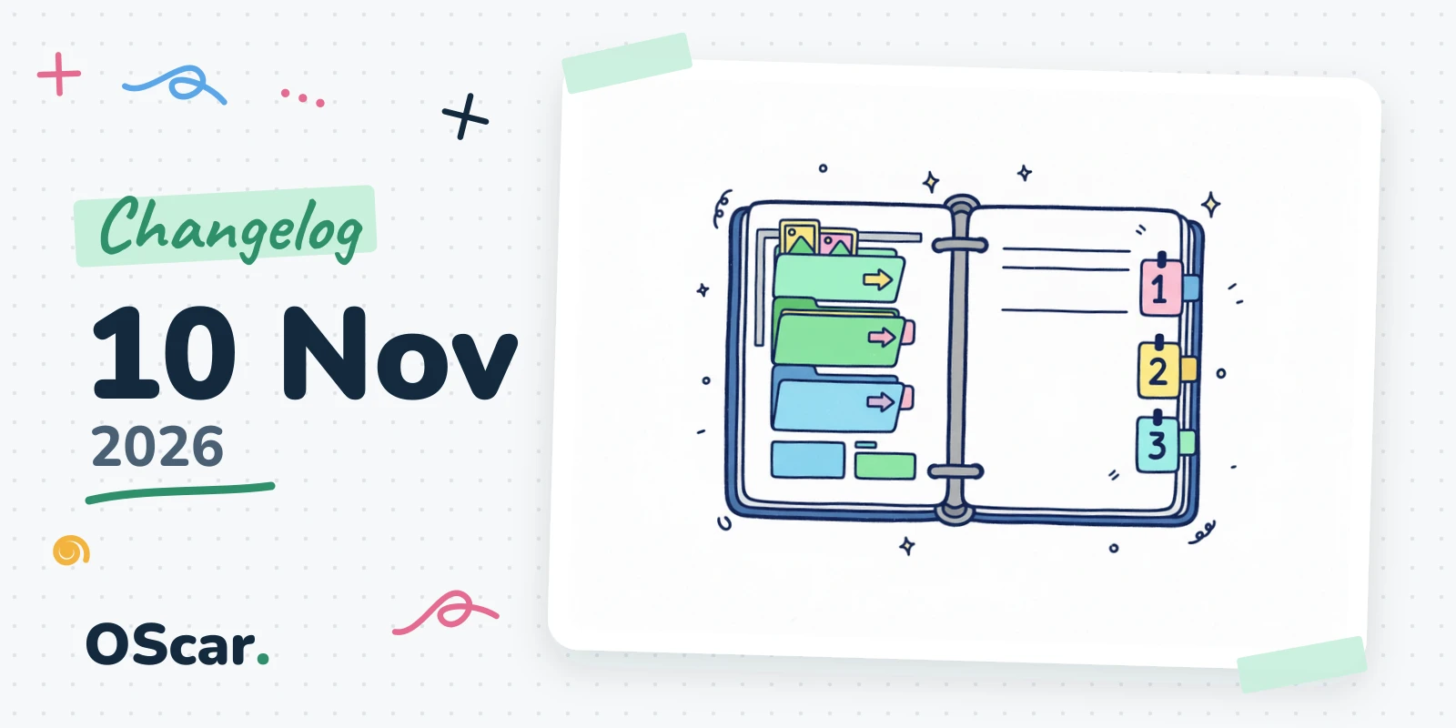
Every post also got a cover. Tool posts are a matching set in each tool's own colour with its icon; diary entries like this one get a doodle of the day's biggest topic, pinned to a sketchbook page. And inside the tool posts you'll now find step-by-step screenshots: real screens of the live app, taken with a demo account full of made-up notes, photos and contacts, so nobody's real data ever ends up on the blog. Little sticky notes with numbers and a neat arrow point at what to press. They're re-taken whenever a screen changes, so the pictures stay true.
Small things
- The Spending page now counts every paid service OScar uses, and it no longer stops at the thousandth row.
- The blog editor's Publish now and Schedule buttons sit centred in their row, with Delete post centred below.
- The "Repeat it" password field now says "Repeat the password", for anyone who wondered what "it" was.
- When a guest comment is refused because comments are off, the message says so plainly.
Next up: more polish, screen by screen, and then the big one, payments, so OScar can open its doors properly. Curious what's inside already? Have a look at OScar.
- changelog
- oscar
- notes
- documents
- photos
- draw